Monochrome is a tool that often divides opinions. Some people think that photography is only truly worthwhile or notable when the hallowed tones of black and white are used, whether on film or through manipulation of digital images. Others believe that monochrome is old hat – a fad used only by amateurs and old photographers who can’t let go of the past. So, where does monochrome stand with landscape photography?
The truth is that, like any technique you could use, monochrome works when it works – and when used incorrectly, it doesn’t. But when it does work, it can be incredibly powerful. Here’s why you should be considering monochrome for your landscape work, and what it will do to transform your images.
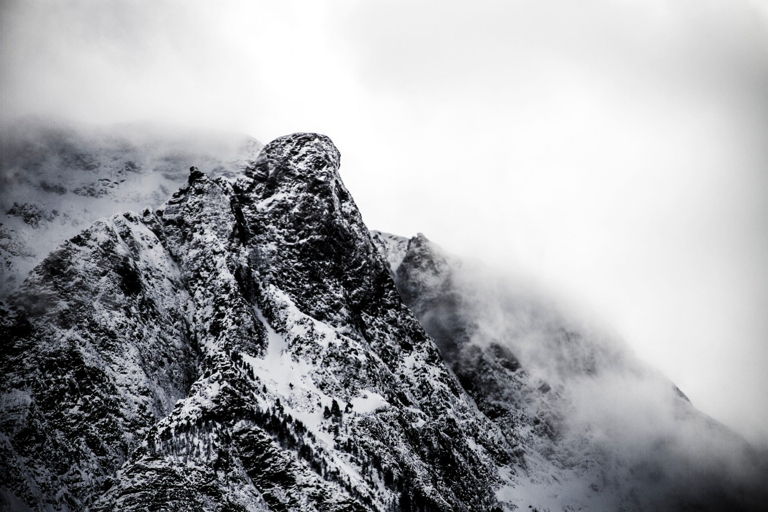
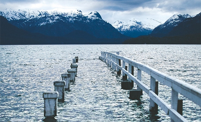
photo by: Caspar Rubin
The inference of importance
One key factor in monochrome photography is the fact that it is so strongly linked to film, and days of the past. When film was all that was available, and even before then to when slides were the only tool photographers could use, the number of shots that they could take was limited. If you had a roll of just 24 frames in your camera, and you knew you couldn’t get hold of any more, then you had to carefully choose what to capture with those 24 frames. Anything that wasn’t of importance would be left behind.
Not only this, but film was a physical object. You couldn’t back it up to the cloud – in fact, you couldn’t back it up at all. If it was lost, burned in a fire, exposed to a chemical spill, developed incorrectly, or even exposed to light before it was developed, then the images were gone forever. At times in the history of photography, it was also expensive to take and develop photographs, and this was another barrier which cut down on the number of photographs that have lasted through to today.
When you put all of these factors together, what you find is that the images which have survived are often images of importance. They are great artistic masterpieces, or images of important people or events, things that have shaped world history. This is what the viewing public generally thinks of when they think about monochrome photographs.
In turn, this has led to an impression that when a photograph is in black and white, it is important. When you render one of your landscape images in black and white, therefore, a viewer will instantly infer that the image they are looking at is of greater importance or greater artistic value. This theory is something you can explore further in Susan Sontag’s seminal book, On Photography.
An homage to the masters
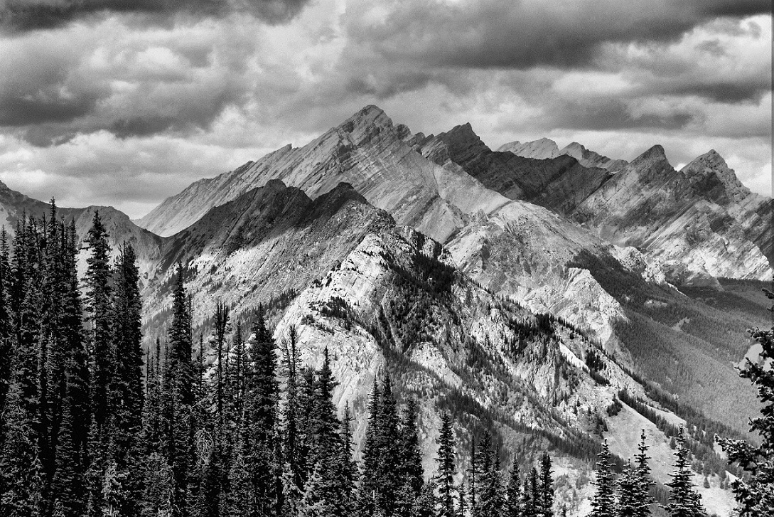
photo by: pixabay.com / CC0
The photographers who are often thought of as the masters of landscape photography are often known for their marked reliance on monochrome, even when colour was available. Ansel Adams and Sebastiao Salgado are two great examples of this.
This creates a similar effect to what we explored above. Because the great masters of landscape photography often shot in black and white, the inference is that a landscape photographer who uses black and white might be a great master. All those stunning postcards, coffee table books, and photo prints of landscapes by these big names sink into the public consciousness, even if the average person on the street couldn’t name either of them.
Therefore, when we see a black and white photograph, we often think of it as being done in the style of the landscape greats. It necessarily follows that this image is probably great itself, and certainly worthy of viewing attention. While it might not result in your work being tagged as a masterpiece, it’s one of the ways in which you can get people to look for long enough to at least decide for themselves.
The impact of contrast
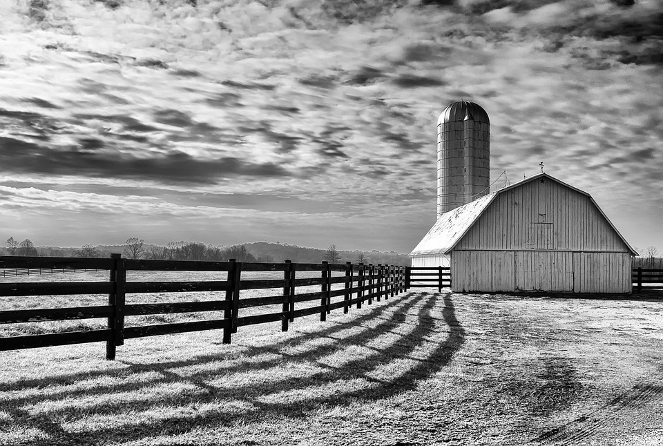
photo by: maxpixel.com
Moving on from the semiotics of monochrome photography, we can look at what it actually does to the image. Firstly, it should be noted that there are many ways to turn a photograph black and white, particularly if you are shooting in colour first and then changing it in post. This means there are ways to edit each individual photograph in a way that makes it more powerful, and also ways to make it less powerful.
One of the great strengths of monochrome photography is in the power of contrasts. When you look at an Adams or Salgado shot of a mountain range, they will usually have one thing in common: the deep contrasts between the bright white of the snowy slopes, and the deep blacks of the shadows that fall in the crevasses between them. These contrasts create a very powerful image, with leading lines and shapes that the human eye can’t help but follow. They make a very compelling story, whether from close up or see far away through a gallery window.
Contrast can be extremely powerful for landscape photography. It can tell so many stories: the dark, rolling clouds of a stormy sky over a pale field of wheat; the dramatic rise in sunshine and fall in shadow of a hillside; the dark branches of a bare tree against a snowscape. It can even reveal the sunken footsteps or tracks of something through the snow, highlighted as dark shadows where they might have shown as just slight indentations with less contrast.
Manipulating contrast in colour images can only go so far before you create an image that looks wholly unrealistic and strange. In monochrome, however, you have far more range to play with those sliders.
Removing the human element
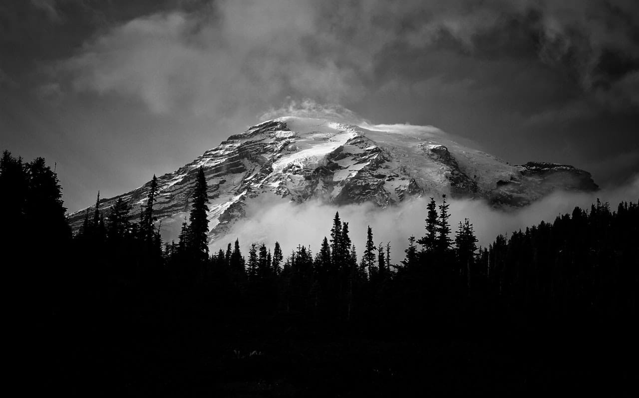
photo by: Balamurugan Anbazhagan from Pexels / CC0
Imagine a green, rolling hillside, dotted with tiny white sheep in the distance and with trees reaching up to an overcast, dark sky. This image sounds pretty powerful – an homage to the strength and beauty of nature. But add in a dog walker in a fluorescent orange jacket peeking out in the middle of the image, and you might feel like the whole ambience has been ruined.
It’s not just humans who can throw a pop of colour into an image that might not feel like it should be there. Buildings, cars and other vehicles, banners, flags, and so forth – they can all get in the way. Even a quaint red post box on an English country lane can be distracting: if it’s the only brightly coloured thing in the frame, then the viewer might focus in on it rather than the beautiful landscape behind it.
Going monochrome can be a great way to diminish the effect of that human element, making anything man-made blend back into the background. On occasion, you might find that a colour pop enhances an image. But when it doesn’t, going monochrome might just solve your problem and leave you with a better image.
All of this is not to say that monochrome is not the only answer for landscape photography. There may well be times when a colour photograph works much better. But monochrome is something that you should certainly be considering – and it may be that extra element which has been missing from your work until now, if you feel like you need to give it some real punch. Give it a try, and you may be surprised.