If you’re aiming to make money from your landscape photography, then selling stock is an excellent option that you may not have maximized yet. Stock images can be bought at a low price for single usage, or they can be bought at a higher price for exclusive rights, whichever feels best to you. All of your efforts might go to waste if you’re not capturing the right images for the market, however. Here are some of the best-selling ideas for landscape stock photography, based on the images that have been bought most often in the landscape category.
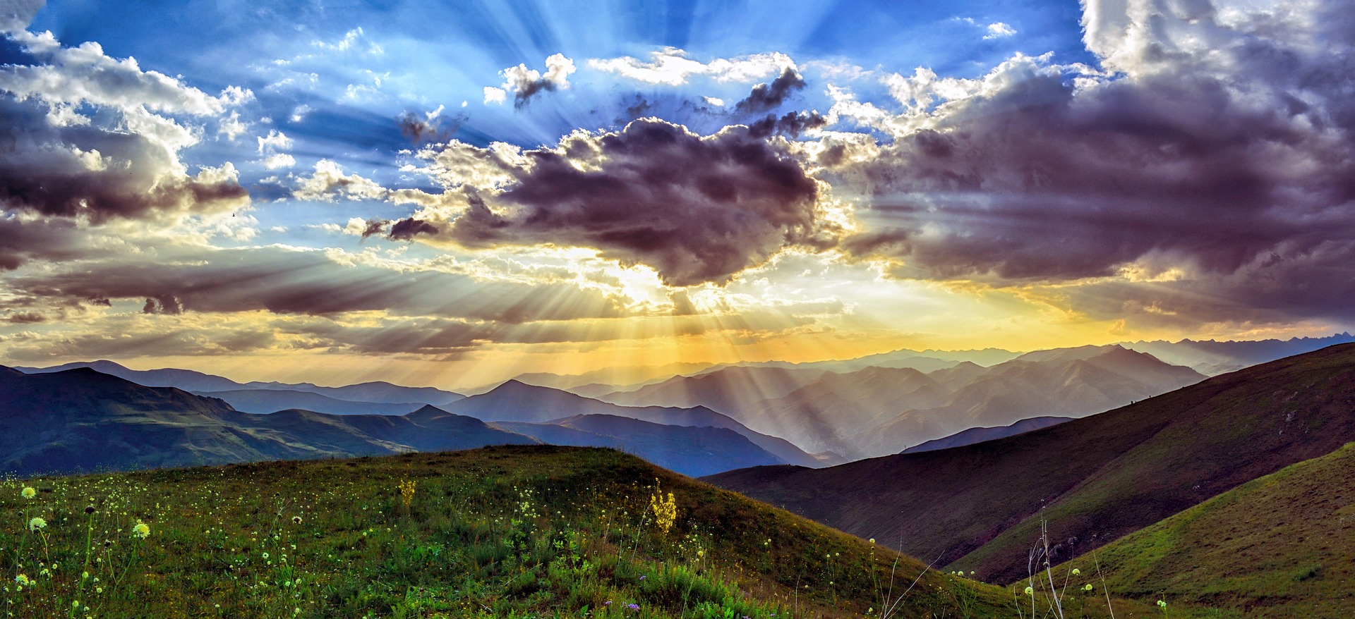
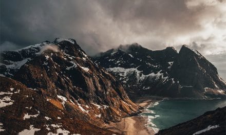
Rising sun, misty mountain
An image of the sun rising slowly from a misty or ethereal mountain range, or breaking out from behind clouds, is always going to be a winner. One of the biggest markets for this kind of image is self-help book covers. If you incorporate a human figure into your landscape, perhaps jumping joyfully in silhouette or throwing their arms up into the sky, you could sell even more images. This is a good category to aim for as there are lots of variations you could try – storm clouds, evening sky, morning sunrise, with or without humans, different landscapes below, and so on. The idea is to create the impression of a journey, and the appearance of hope or success at the summit.
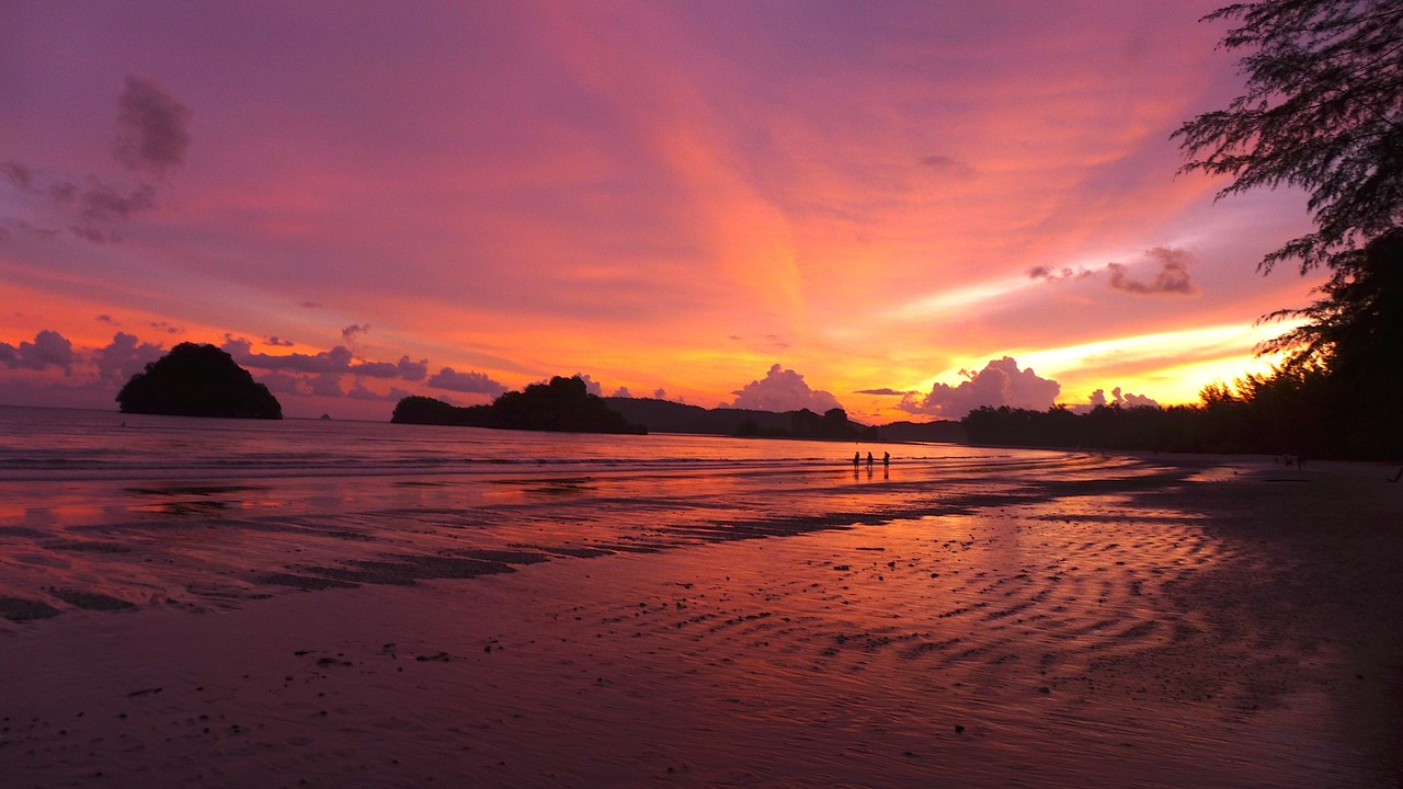
Orange and pink sunsets
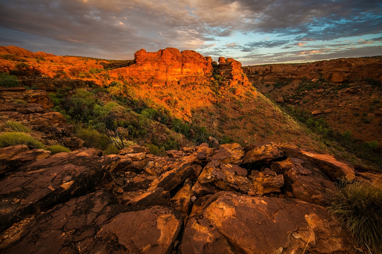
No matter how stunning your landscape may be, you will almost always sell more copies of the image by including the orange and pink tones of sunset. Unusual colours, such as a really deep orange shining through dark stormy clouds, will sell even better. This dramatic look is really eye-catching, and lends extra dimension to any scene. The best results come from mirrored surfaces, such as water, which reflect the colours back – or from similar natural colours below the sky. For example, a field of lilac flowers will echo the purplish tones of the sky while contrasting against orange and pink clouds.
Mist for dimension
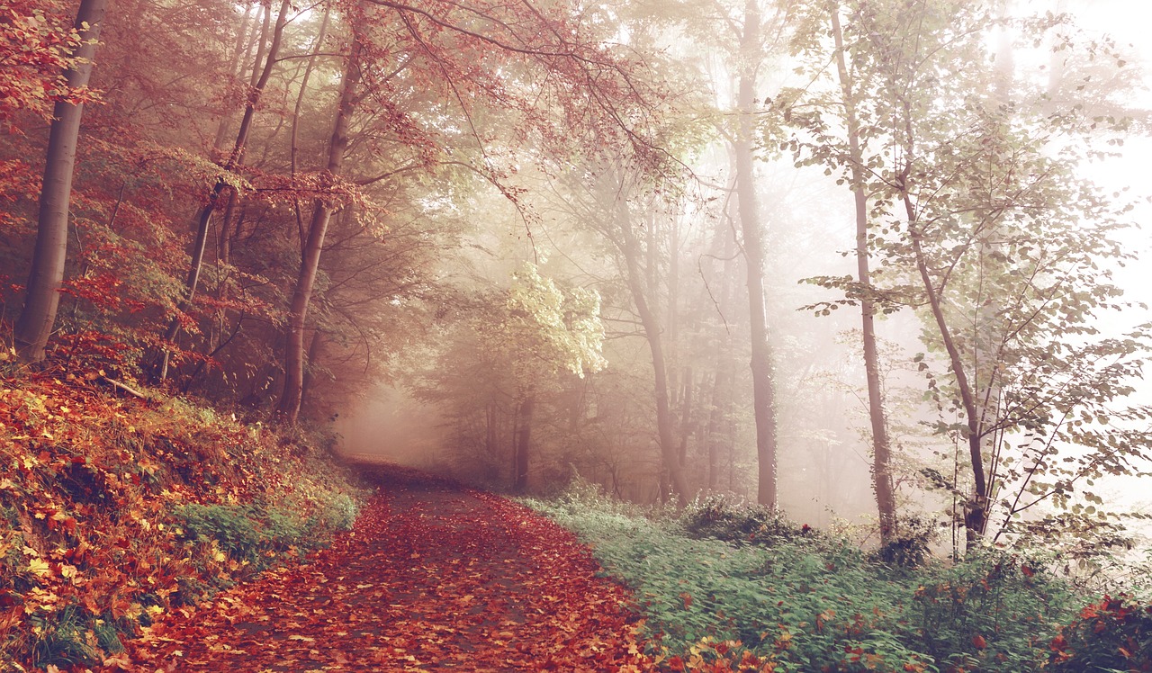
You can add depth to your images by photographing landscapes, especially those with different focal points, at times of mist or fog. The effect will give different tones throughout the image, add a sense of mystery, and help the viewer to understand the dimensions of the scene – such as how far away the background is from the foreground. It’s also great for editorial use as it looks so dramatic.
Horizon line
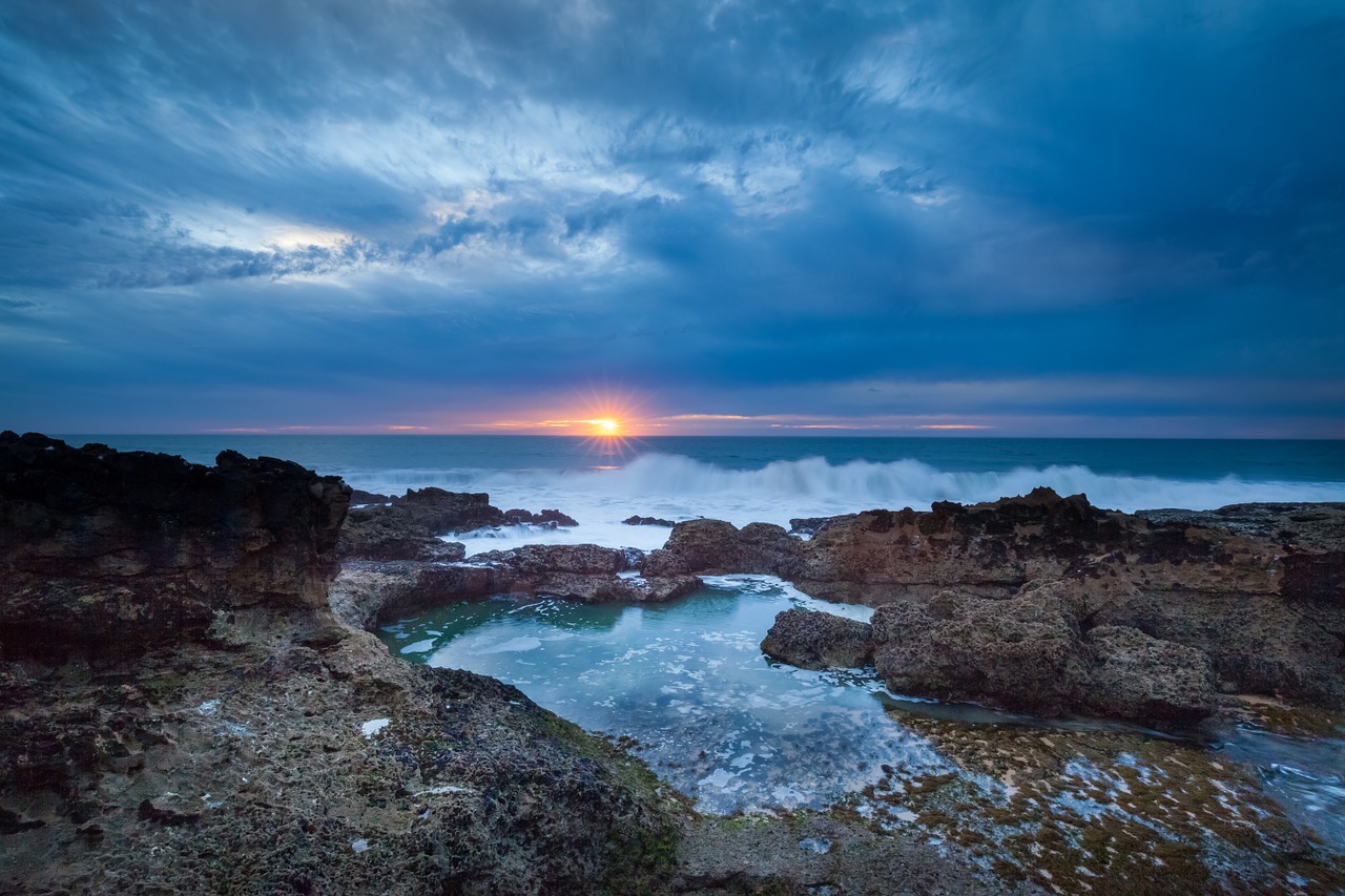
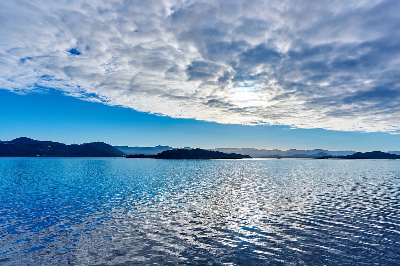
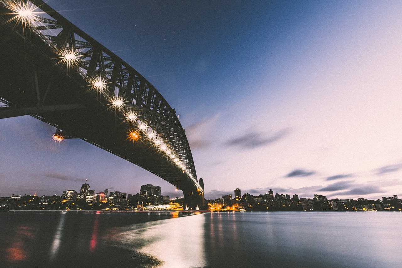
A huge category of images that seem to sell very well are those split by a line right across the middle of the image. This could be a horizon line, with blue sky above and open fields rolling below. It could be a line between the landscape above and then a reflection in a body of water below, giving symmetry to the two halves of the image. You could also use natural components to fill the frame, such as a dramatic mountain range in the top half above fields and valleys leading towards it in the bottom half.
Generic landscapes
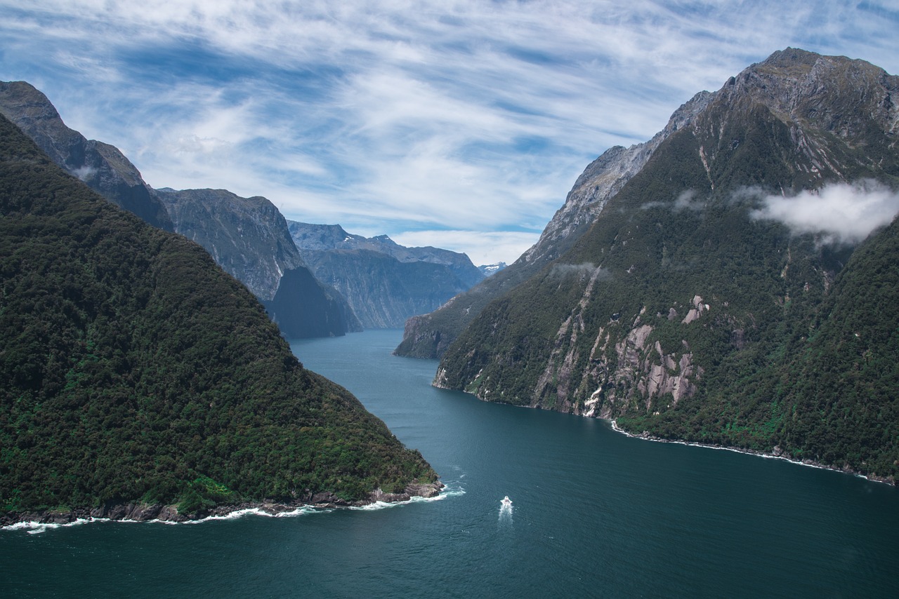
You might expect that the best-selling images would be of famous spots like the Grand Canyon, or Mount Everest. The truth of the matter is that everyone with a camera is taking shots of these places and then uploading them to stock sites, which means that the demand is actually lower than the supply. As a result, you won’t demand much of a price for these images unless you manage to pull off something really spectacular. Instead, you should be looking for more generic landscapes, less recognizable as specific locations. This will allow them to be used as stock accompanying articles, or on book covers, without them needing to be linked to a real place. Mountains, lakes, and wide fields with panoramas tend to be the images that do best.
Seasonal images
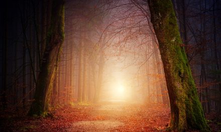
Seasons are a popular choice, especially when used in an atmospheric way. A forest or woodland path littered with blazing fall leaves is a great example here, as is a landscape buried deep in snow. Both of these do great at evoking the season for audiences of a more global viewpoint, as they are not too closely linked to something particular – skiing images, for example, give the impression of winter but they do so in a way that evokes sports, wealth, and particular mountain regions rather than being more universal.
Colour toning
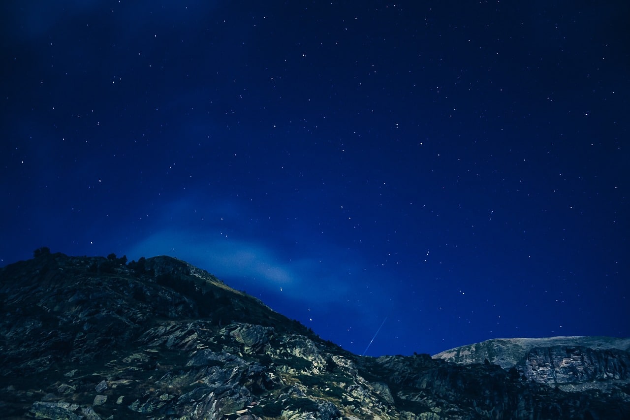
Using colour carefully is a great way to get your images used editorially. Particularly for magazine or book cover usage, these shots can be very atmospheric. For example, try capturing the blue and green aurora borealis above the blue-toned snow; purple and pink sky tones above a lake, with mountains captured in the same colour scheme thanks to the light; the orange glow of the sun covering everything in the scene; bright green and pink flowers and grass in a field framed by white mountains; sepia toning or black and white; a white snowscape against a white cloudy sky; sandy dunes of a desert stretching off into the distance; the deep blues of a night-time scene. Using complimentary colours, or all tones from the same colour family, makes it easier to use your image as a graphic design element.
Leading lines
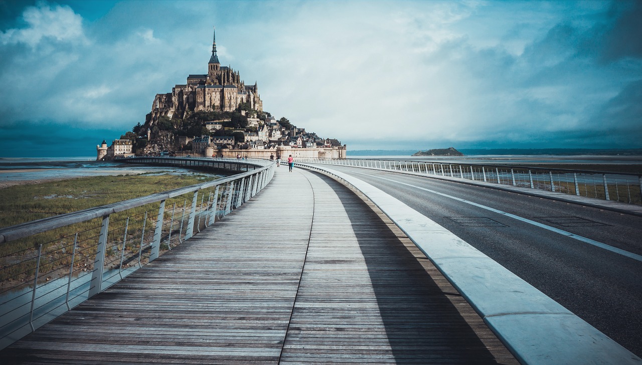
Images which take us on a journey also tend to be very popular with buyers. Leading lines are formations which bring our eyes across the image in a certain way, which makes them tell us a story. A path leading out into the woodland, or a road stretching across the desert, can both be equally effective in different contexts. Again, these are popular with book covers and for magazine usage, as they help to accompany text or give the viewer the impression of a story waiting to be told.
Focal points
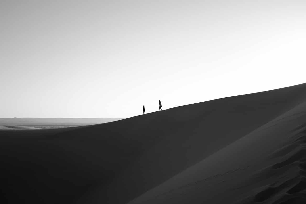
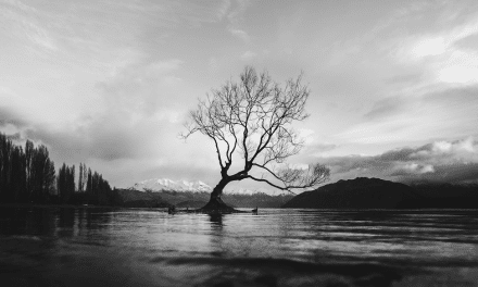
Having one stand-out point to focus on really helps to make an image stronger, and this seems to be reflected in the editorial choices of those buying from stock websites. You will notices that landscapes with a single tree standing out in an open space tend to be a repeated theme in the most popular images. Other ways to use this include other natural formations such as large rocks and boulders, people walking or moving through the landscape, and even man-made objects such as boats, vehicles, buildings, or other structures. You could even choose a wild animal as the focal point of your image, though depending on the stock site you list your images on, this might just shift you over to the wildlife category rather than landscape.
Open space
Particularly when thinking about graphic design and layout, editors like to choose images which have empty or open space to use. These can be areas where text is placed, or somewhere for new elements to be brought in. So, how can you add negative space into a landscape image? One way is to use a large area of the same tone, such as the sky or water. You can also use depth of field to create a single focal point, with the rest of the image blurred out to provide an easier space for text overlays. Or, there’s always nature’s solution: a background which fades out into mist or fog.
With these ideas in mind, you should be able to create landscape stock photographs which sell well. Remember that the best images are ones that can sell at any time of year, in any country, and be used for just about any purpose – so the more generalised your image can be, while still retaining unique drama and perspective, the better. It’s also important that you know how to position your images, using the right title, description, and keywords to ensure that they show up in searches when you have listed them on the stock website of your choice.
Photo license link: CC0



I always thought cutting the photo in half down the middle was a big NO NO with correct compostition.