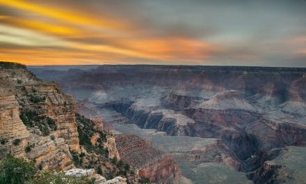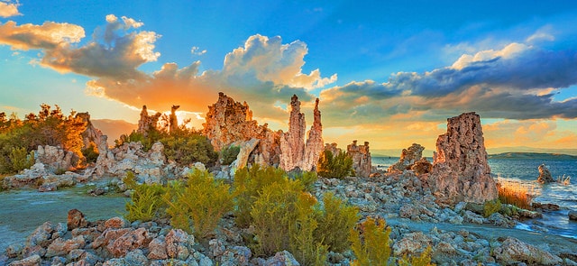
Image: Rennett Stowe / CC BY 2.0
While it’s something that we tend to overlook, color plays an important role in photography.
The right use of color can help to present your composition in a visually appealing manner. It can also have a dramatic impact on how you, and others, view the image. The colors in an image can help to convey emotion, set a scene, or highlight the main point of interest in an image; helping an image to feel alive, mysterious, somber, or even melancholic.
For landscapes, it’s easy to feel like the colors that are in a scene are largely out of our control. But while it’s true that you can’t transform a lackluster landscape into a composition that’s full of color and beauty, there’s still a lot that you can do to incorporate more color into your images.
While you won’t have complete control over the colors in a scene, being aware of the impact that different colors have can help you to spot excellent color combinations when you see them. And knowing what to look for is an important part of capturing exciting and vibrant images.
With this in mind, let’s take a look at color theory; and see the impact that colors can have on your landscape and nature images.
Color Theory
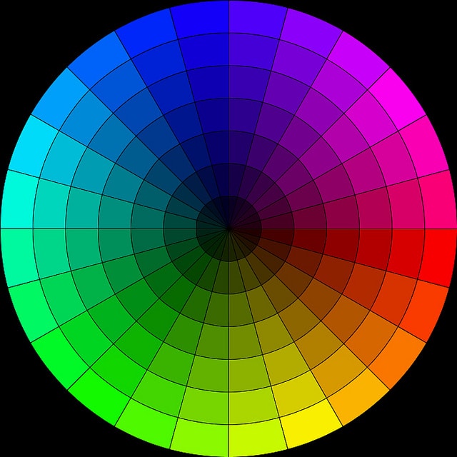
Image: Robson#
The color wheel is an illustrative organization of different colors in a circle. It’s designed to show the relationship between primary colors, secondary colors, tertiary colors, and more. The color theory involves using this wheel, to create a specific grouping of colors for an effect that’s visually and emotionally appealing.
While there are many groups of colors that could be considered harmonious, some work especially well together. Here’s a look at some of the main color combinations, and examples of how they work.
Analogous Colors
Analogous colors are a series of colors that lie directly next to each other on the color wheel. This group of colors can consist of anywhere from two colors to on up to half the wheel. Consider a landscape such as a waterfall in the woods. The greens and blues would be a good example of an analogous color scheme.
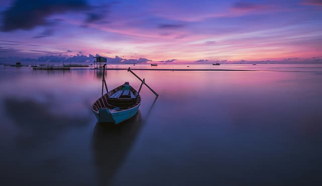
Image: Lenny K Photography / CC BY 2.0
Complementary Colors
Complementary colors are found directly across from each other on the color wheel. Warm-cool color combinations could often be considered complementary. For example, blue skies and warm orange tones of the sun being cast on a mountainside would be complementary.
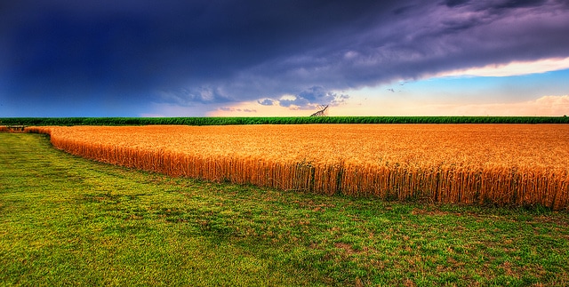
Image: James Watkins / CC BY 2.0
Split Complementary Colors
Split complementary is another combination that’s found in nature. This combination would feature two complementary colors, as well as an additional color that’s located directly next to one of the complementary shades. It’s a common color scheme that is often found in the natural world –and it’s one that works beautifully.
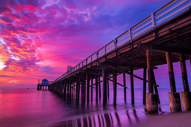
Image: ™ Pacheco / CC BY-ND 2.0
Triadic
A triadic color scene features a combination of any three colors that are spaced out evenly from each other on the wheel; another combination that’s often found in nature photography.
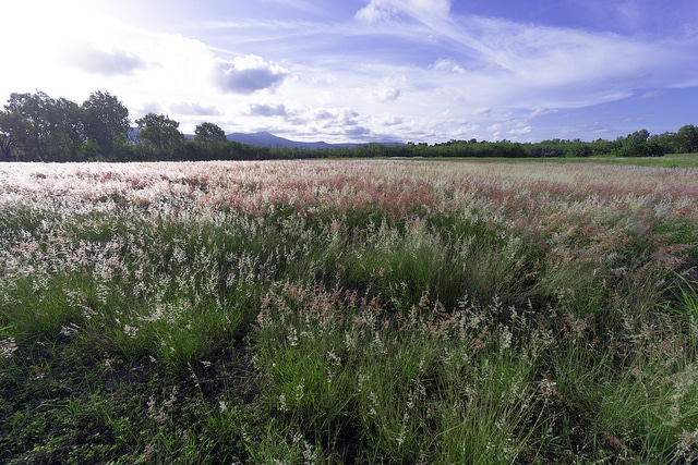
Image: Lenny K Photography / CC BY 2.0
Quadratic
A quadratic color scheme involves combining two complementary color schemes. This combination could also be called a double complementary scheme.
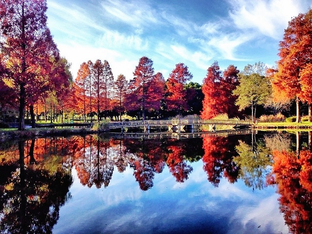
Image: Yusuke Umezawa / CC BY 2.0
Monochromatic
A monochromatic color scheme consists of the same color, in varying degrees of brightness or saturation. Most commonly, this color scheme can be seen in black and white images.
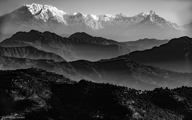
Image: Francesc Genové / CC BY 2.0
There are, of course, many other color combinations you can choose from to help make your landscape photography stand out. It’s also important to note that in many ways, color theory, and understanding which combinations work well –is more of an art than a science. Learning what looks good together is often the result of practice, and trial and error.
Eventually, you’ll be able to tell at a glance when a combination just works.
Colors and Emotions
In addition to creating a visually interesting image when used in a combination, individual colors can evoke an emotional response on their own. Featuring certain colors in an image can result in a composition that has a certain feel to it; whether it’s tranquility, life, energy, and more.
Here’s a look at some emotions that different colors are often associated with, as well as some tips for working with these colors.
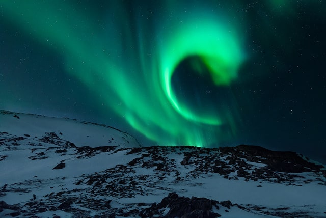
Image: Lenny K Photography / CC BY 2.0
Blue
On the cool spectrum, the color blue is often associated with tranquility and calmness. Darker blues tend to signify dignity and intelligence while light blue is most often associated with peace. Blue is also one of the easiest colors to find in landscapes and nature since it can be found in the sky and water.
Green
Also on the cool spectrum, green is commonly associated with feelings such as hope, life, and growth. Green is found abundantly in nature scenes as well. In many cases, greens work well when used in analogous combinations, featuring a range of different shades of this color.
When post-processing, keep in mind that adding a bit of blue to your greens can really help them to come alive.
Red
Colors that are at the warm end of the color spectrum tend to stand out. Red, in particular, is a warm shade that demands to be seen. This color tends to convey a sense of courage, urgency, or caution.
Red is also one of the easiest shades to blow out, so take care when applying saturation in post-processing.
Yellow
Also on the warm side, yellow is a warm and energetic color that evokes feelings of happiness, possibly due to the fact that it’s most often associated with the sun. Most of the yellows in landscape photography will be in the sky, in fields, or flowers.
Orange
Another warm shade, orange, much like yellow, tends to appear in the sky and in flowers in landscape photography. During post-processing, you’ll want to take special care to prevent orange hues from becoming too dark and desaturated as this will cause them to turn brown –not a good color for a sky.
Brown
An unsaturated warm color, brown doesn’t command attention like some of the other fiery colors in the warm spectrum. Brown tones tend to add a sense of stability and dignity to an image.
Dominant Colors
Color is wonderful, but too much bold color will result in a chaotic and overwhelming image. Too many bright colors will create multiple focal points, making it difficult for the viewer to identify the main point of interest. When composing your image, keep in mind that in most cases, the brightest and strongest colors will usually signify the main point of interest; and will naturally be where your eye will be drawn as well.
In post-processing, take care to avoid making all of the colors fully saturated; instead –use selective saturation and brightness to intentionally draw the eye toward the main focal point.
Controlling Color
While you can’t control the color in the landscape, per se, there are a few things that you can do to adjust the color in your composition. The first thing that you can do is to adjust the composition itself to feature more, or less, of a particular color; for instance, you can adjust your position or angle, or zoom in or out. Light can also greatly impact the colors in a landscape image, so consider the timing of your shots.
If you’re hoping to incorporate more golden, yellow tones, you’ll want to arrive at the golden hour, the time of day just after sunrise, and again late in the evening. If you are looking for softer, more muted shades, you might choose early morning before the sun is fully out. Of course, you can also adjust the tone, saturation, and brightness of your colors in post-processing.
Just remember to shoot in RAW, as this will give you the most control over your resulting images.
If you’re looking to capture amazing landscape images, you’ll want to pay attention to the colors. This doesn’t mean that you’ll have to identify a color scheme as ‘analogous’ or ‘triadic’ in order to create compelling images, but it doesn’t hurt to brush up on different color combinations and learn about why they work so well.
In time, you’ll develop an eye for what works and will be able to tell at a glance whether a certain combination of colors looks good. Soon working with different colors in your compositions will become second nature to you.
With this in mind, here’s a look at a few things that you can do now, taking note that many of these are steps that you can take before you release the shutter. While there are ways to enhance your colors in post-processing, there’s a lot that you can do ahead of time as well. When it comes to enhancing colors, your best option often involves using a combination of both in-camera and post-processing techniques to get the results that you’re after.
Let’s take a look now!
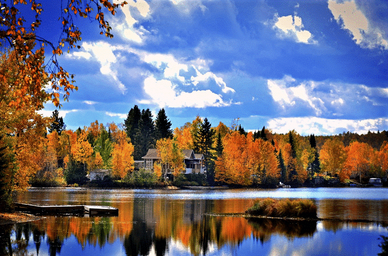
photo by: pxhere.com
Use a Polarizer
A polarizing filter is an excellent tool for helping your colors to stand out. Polarizers help to reduce surface glare, which means they can reduce the sheen on the surface of leaves, or even wet rocks; helping your image’s colors to appear deeper and more saturated. They can also help to reduce atmospheric haze, which is why photographers often use them to deepen the blue of the sky.
photo by: Chris Abney
Look to Incorporate Colorful Elements
You don’t have to fill your composition with color in order to create eye-catching results; sometimes, a splash of color is all that it needs. For example, look to incorporate bright, colorful flowers in the foreground to add visual interest and draw the viewer into the photo. In addition to the foreground, looking to capture colorful elements that are in the distance –a bright red barn, a colorful hot air balloon, even a ship –can all help to draw your eye into the photo as well –especially when it contrasts with the background.
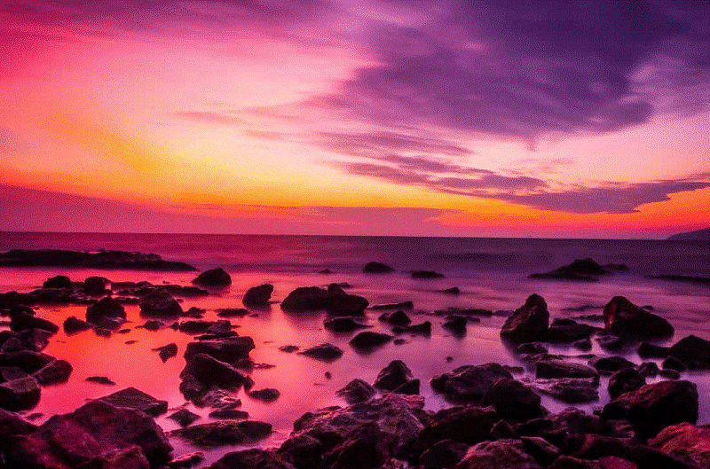
photo by: pixnio.com
Shoot at an Optimal Time of Day
The best colors are found during specific times of the day. Sunrises or sunset, for example, is a specific time for capturing bright, bold colors in the sky. Likewise, “golden hour” –that time of day just after sunrise and again just before sunset is ideal for capturing landscapes that are awash in a beautiful golden glow. Believe it or not, slightly overcast days can actually be a great time for capturing colorful images.
The clouds will act as a giant softbox, gently diffusing the light, resulting in deeper, more saturated colors.
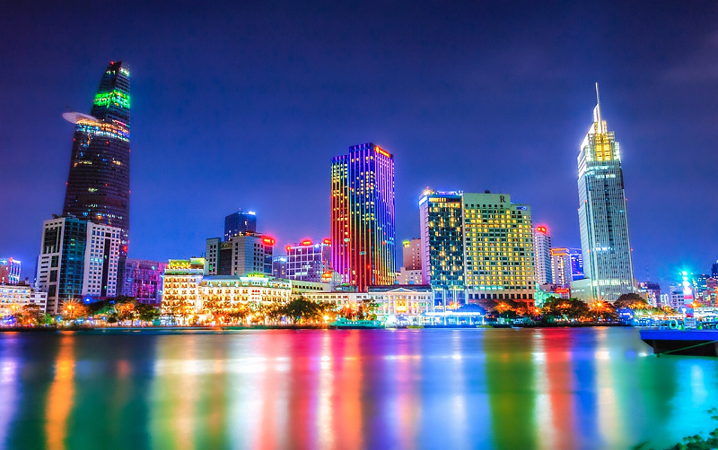
photo by: minanfotos / CC0
Look for Additional Light
While you should take advantage of the natural lighting that’s available, in some cases, you may want to use additional light sources to enhance your images as well. For example, you can use an off-camera flash to help illuminate the foreground during low-light conditions; or use it as a fill-flash to help fill in dark shadows when working with harsh light. And for images that are taken after dark, consider looking for additional light sources that you can use.
Street lamps, for example, bridge lights, or the reflection of the city lights on the surface of the water can help to draw out brilliant, bold colors at night.
Adjust Your Exposure
If your colors just aren’t as vibrant as they should be; you could try bumping your exposure down a bit to see if it helps your colors to appear any richer. Even going down 1/3 a stop can be enough to help an image to appear more vibrant. Keep in mind, too, that it’s better to slightly underexpose an image than it is to overexpose it. It’s easy enough to recover details in dark shadowed areas in post-processing, but recovering blown-out highlights is a lot more difficult.
photo by: pxhere.com
White Balance
Just as a different light bulb can give you a different ‘color’ of light, adjusting your camera’s white balance settings can help to adjust the overall color cast in your image. Most cameras come with several preset white balance modes, and if you find that your images have an unsightly color cast, it’s easy enough to adjust your white balance settings.
- Tungsten– The tungsten setting is best for indoor photography as it tends to cool the colors in your image down.
- Fluorescent– The term fluorescent means ‘glowing, bright or flaming.’ As the name suggests, this preset warms your shots up.
- Daylight– Daylight is generally used for shooting during normal daylight hours.
- Cloudy– Cloudy is perhaps the most commonly used white balance setting. It adds a bit more warmth than the daylight setting and is often referred to as ‘giving a kick’ to an image.
- Flash– This setting also warms up your image, especially if you are using flash since that tends to give more of a cool light.
- Shade– Again, the shade setting will help warm up your color.
Or finally, or you can take matters into your own hand and adjust your white balance manually, giving you the best chance at capturing the colors you see. This is especially ideal if you’re shooting during quickly changing lighting conditions. To start, set your camera to PRE (Preset manual) mode.
Then, find a white object or place a 50% grey card in front of your camera. Then, take your picture –and your white balance will be set!
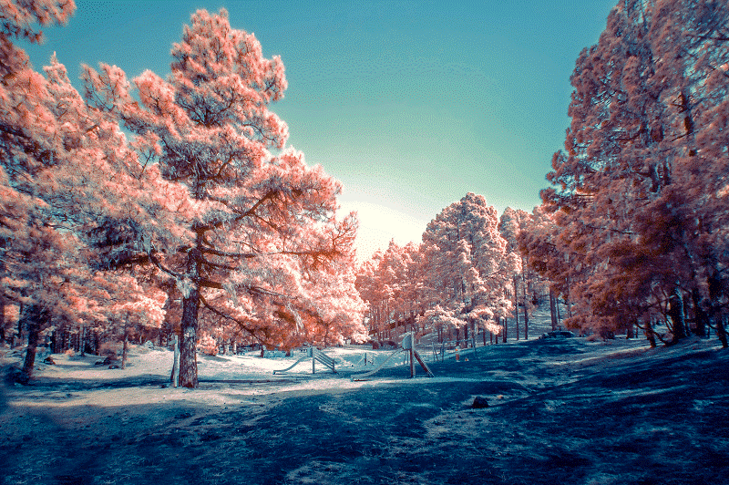
photo by: Fausto García
Post-Processing Tips
In some cases, post-processing can also help to enhance your landscapes’ colors. Colors that are brighter and more saturated will feel lighter and more vibrant, while darker hues will appear more muted. It’s also important to remember that each color has its place –whereas some darker hues can help the image to appear more natural, areas that are receiving direct light can often stand to have the saturation increased.
Just avoid making all of the colors appear bright and bold, as this can produce unrealistic results. Oftentimes, subtle is better –especially when landscapes are concerned, and if a realistic-looking image is what you’re after. Be sure to shoot in RAW for the most flexibility in post.
So there you have it, simple tips for enhancing the colors in your images. While incorporating colors –and working to enhance the colors in your images can be a challenge, it can also be tremendously fun, and rewarding. Look out for the right lighting, try to make the most of it, and then look for colorful features to include in your landscapes.
Soon capturing vibrant and colorful images will become second nature to you.
Have you applied color theory to your landscape photography? Or do you have an eye for what looks good?
Photo license links: CC BY-ND 2.0, CC BY 2.0